Pantone matching is the practice of reproducing a specific, standardised colour, identified by a Pantone reference, as faithfully as possible in a physical object, so that a bespoke award matches a brand’s exact colours rather than an approximate guess. For high end trophies that must sit alongside a company’s identity, this precision is what separates an award that looks convincingly on brand from one whose colours feel slightly, distractingly wrong.
What Pantone matching means
Pantone is a widely used colour system that gives each colour a precise, standardised reference. Rather than describing a colour vaguely as a certain blue, a brand can specify an exact Pantone number that means the same colour to everyone, everywhere. Pantone matching is the effort to reproduce that specified colour accurately in a finished product. For an award, it means taking a brand’s official colours and rendering them faithfully in the physical piece, whether in a coating, a coloured material or a printed element.
This matters because colour is central to brand identity. A company’s colours are chosen and protected carefully, and seeing them reproduced correctly signals quality and attention, while an off colour version quietly undermines the whole impression.
Why colour accuracy matters for premium awards
An award frequently appears in branded settings: on a stage beside a logo, in photographs shared across a company’s channels, on a shelf in a corporate lobby. In every one of these contexts, the award’s colours are read against the brand’s established palette. If they match, the piece feels integrated, considered and premium. If they are noticeably off, the eye catches the discrepancy immediately. For a bespoke custom trophy meant to embody a brand’s prestige, faithful colour is not a detail, it is part of the message.
The challenge of matching colour in three dimensions
Matching a Pantone colour on a flat printed page is one thing; matching it on a three dimensional object made from a physical material is more demanding. The base material has its own colour and translucency. Surface finish, whether glossy, matte or textured, changes how colour is perceived. Lighting shifts appearance. A colour that looks right under one light can look different under another. Achieving a faithful match therefore requires understanding how the colour, the material and the finish interact, which is why colour is considered together with the choice of material rather than as an afterthought.
How matching is approached in award production
Faithful colour begins with a clear, specified target, ideally an exact Pantone reference rather than a screenshot or a rough description. From there the studio considers how to achieve that colour in the chosen process: through coloured material, applied coatings or printed elements, each with its own behaviour. Test pieces and comparisons against physical references help close the gap between intention and result. This methodical approach turns a brand’s stated colours into a physical match a client can trust.
What helps achieve an accurate match
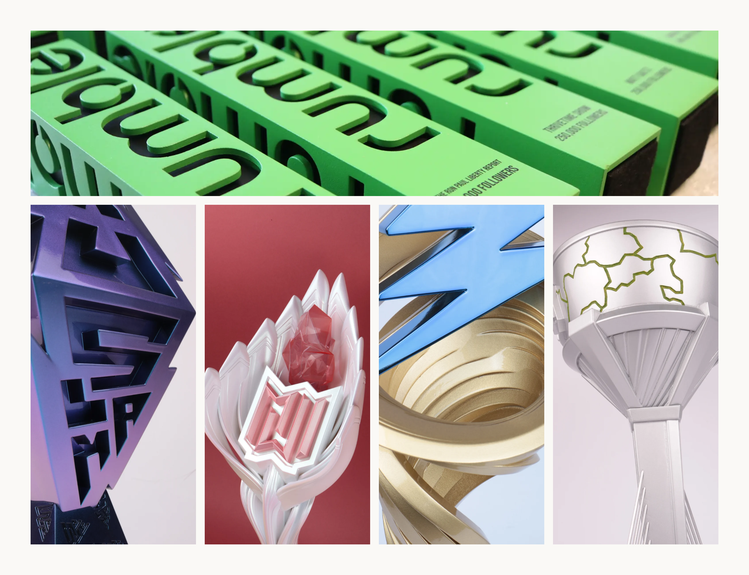
- A precise Pantone reference, so the target colour is unambiguous rather than a guess from a screen.
- Awareness of the base material, since its own colour and translucency influence the final appearance.
- Consideration of finish, because gloss, matte and texture all change how a colour reads.
- Physical reference comparison, checking results against real swatches rather than screens alone.
- Consistent viewing light, since colour can shift noticeably under different lighting conditions.
The honest realities of colour matching
It is important to be candid: a perfect, absolute match is not always physically achievable, because materials and finishes have real limits. Some colours are easier to reproduce than others, and translucent or metallic materials behave differently from opaque ones. A responsible studio explains these realities and aims for the closest faithful result the chosen material allows, rather than promising an impossible exactness. This honesty is part of an advisory approach, setting expectations clearly so the finished award satisfies rather than disappoints.
Colour as part of the whole design
Colour does not exist in isolation from the form. The way a colour reads is affected by the shape it sits on, the surfaces that catch light and the overall design. This is why colour is considered alongside the modelling and finishing of the piece rather than bolted on at the end. When a client shapes a concept, whether through direct conversation or by exploring options via the online design tool, brand colour can be woven into the design thinking from the start, so the finished award feels coherent in both form and colour.
How clients experience Pantone matching
For a client, faithful colour matching means their award looks unmistakably theirs. The technical work of interpreting a Pantone reference, choosing how to achieve it and testing the result is handled by the studio. What the client receives is a trophy whose colours align with their brand, ready to stand proudly beside their logo and appear correct in every photograph. It is one of the finishing touches that makes a bespoke award feel truly tailored rather than generic, and it complements the care invested in every 3D printed trophy.
Frequently asked questions
Can you match my exact brand colour? The studio aims for the closest faithful match the chosen material and finish allow, working from a precise Pantone reference. Some colours match more perfectly than others.
What should I provide for colour matching? Ideally the exact Pantone reference for your brand colours, rather than a screenshot or a description, so the target is unambiguous.
Why might the colour look slightly different in different places? Colour appearance shifts with lighting and finish. A colour matched carefully can still read differently under very different lights.
Does the material affect the colour? Yes, significantly. The base material’s own colour, translucency and finish all influence the final result, which is why colour and material are chosen together.
Pantone matching is how a bespoke award speaks a brand’s visual language precisely. Achieved through a clear target, an understanding of material and finish, and honest expectations, faithful colour ensures a trophy looks unmistakably on brand, a small but telling mark of the care that defines a truly premium, tailored award.
Related terms