Proportion is the relationship in size and scale between the different parts of a design, and between each part and the whole. In trophy and award design, proportion determines whether a piece feels balanced, dignified, and premium, or awkward and unresolved, because the human eye instinctively judges an object by how its elements relate to one another long before it registers any single detail.
Proportion is the invisible discipline behind every object that simply feels right. You cannot always name why one trophy looks elegant and another looks clumsy, but the answer is almost always proportion. At Fabit, getting proportion right is the foundation on which every other design decision rests, and this entry explains why it deserves such careful attention.
What proportion means
Proportion describes how the dimensions of parts relate to each other. The height of a base compared to the sculpture above it. The width of a logo relative to the surface it sits on. The thickness of a form compared to its height. When these relationships are harmonious, the object reads as intentional and calm. When they are off, the object feels wrong even to viewers who cannot explain why.
Designers have studied proportion for millennia, from the golden ratio of classical architecture to the modular systems of modern design. The underlying truth is simple. Our eyes and brains are exquisitely tuned to relationships of scale, and pleasing proportion registers as quality.
Why proportion is decisive for awards
An award has to project dignity. A trophy with a base too small for its sculpture looks unstable and cheap, as if it might topple. A base too large looks heavy and clumsy. A logo scaled too big shouts, while one scaled too small disappears. Every one of these is a proportion failure, and every one undermines the sense of prestige an award is meant to convey. Because we build awards to honour real achievements, proportion is never an afterthought in our custom trophy service.
Proportion between sculpture and base
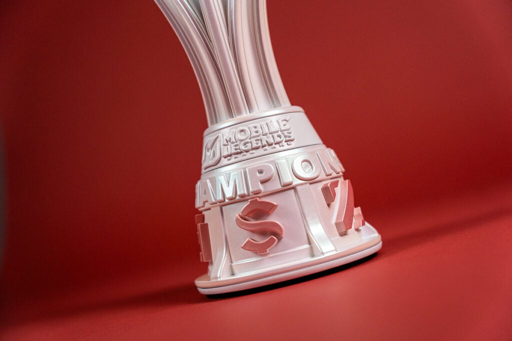
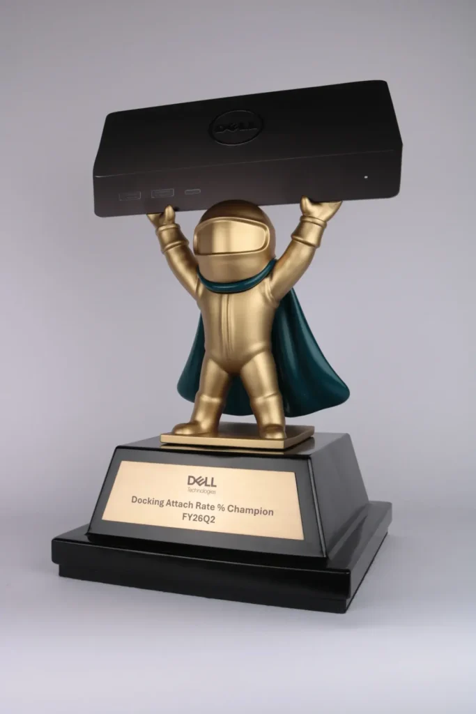
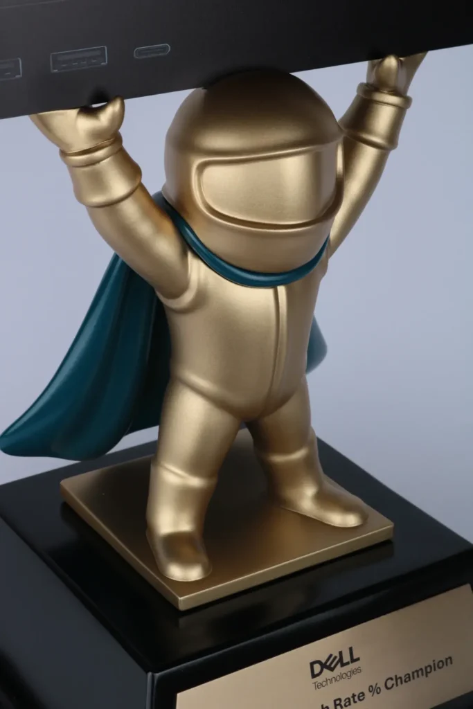
One of the most important proportional relationships in any award is between the main form and its base. The base grounds the piece both visually and physically. Too slight, and the sculpture looks precarious. Too dominant, and it overwhelms the very thing it should support. Finding the right ratio gives the award stability, presence, and a sense of rootedness. We test this relationship carefully in our digital models before committing to production.
Proportion of branding and text
Corporate awards carry logos, names, dates, and sometimes longer inscriptions. How these relate in size to each other and to the surface is pure proportion. A recipient’s name should usually be prominent, a date more modest, a supporting line quieter still. When this hierarchy is proportioned well, the eye reads the piece effortlessly in the right order. When it is not, the message is confused. We treat text proportion as an integral part of the design, not a label added at the end.
Proportion and perceived value
Proportion is one of the strongest drivers of perceived value. Luxury objects almost always have carefully resolved proportions, because the manufacturers understand that harmony reads as quality. A well proportioned award feels expensive even in inexpensive materials, while a badly proportioned one looks cheap even in gold. This is why we invest design time in proportion before anything else, and why it is central to the premium character our clients expect.
Design decisions governed by proportion
- The ratio of the base height and width to the sculpture above it
- The scale of the logo relative to the surface that carries it
- The hierarchy of sizes among name, date, and supporting text
- The thickness of forms relative to their height and width
- How negative space is proportioned against solid material
- How the overall size suits the venue and the moment of presentation
Testing proportion digitally
Our in-house 3D design workflow is invaluable for proportion, because we can view a piece from every angle, adjust ratios instantly, and preview the result before any material is used. We often produce several proportional variations of the same concept so a client can feel the difference directly. You can begin experimenting with scale and balance yourself in our online design tool, which makes proportional relationships visible immediately.
Proportion across an award family
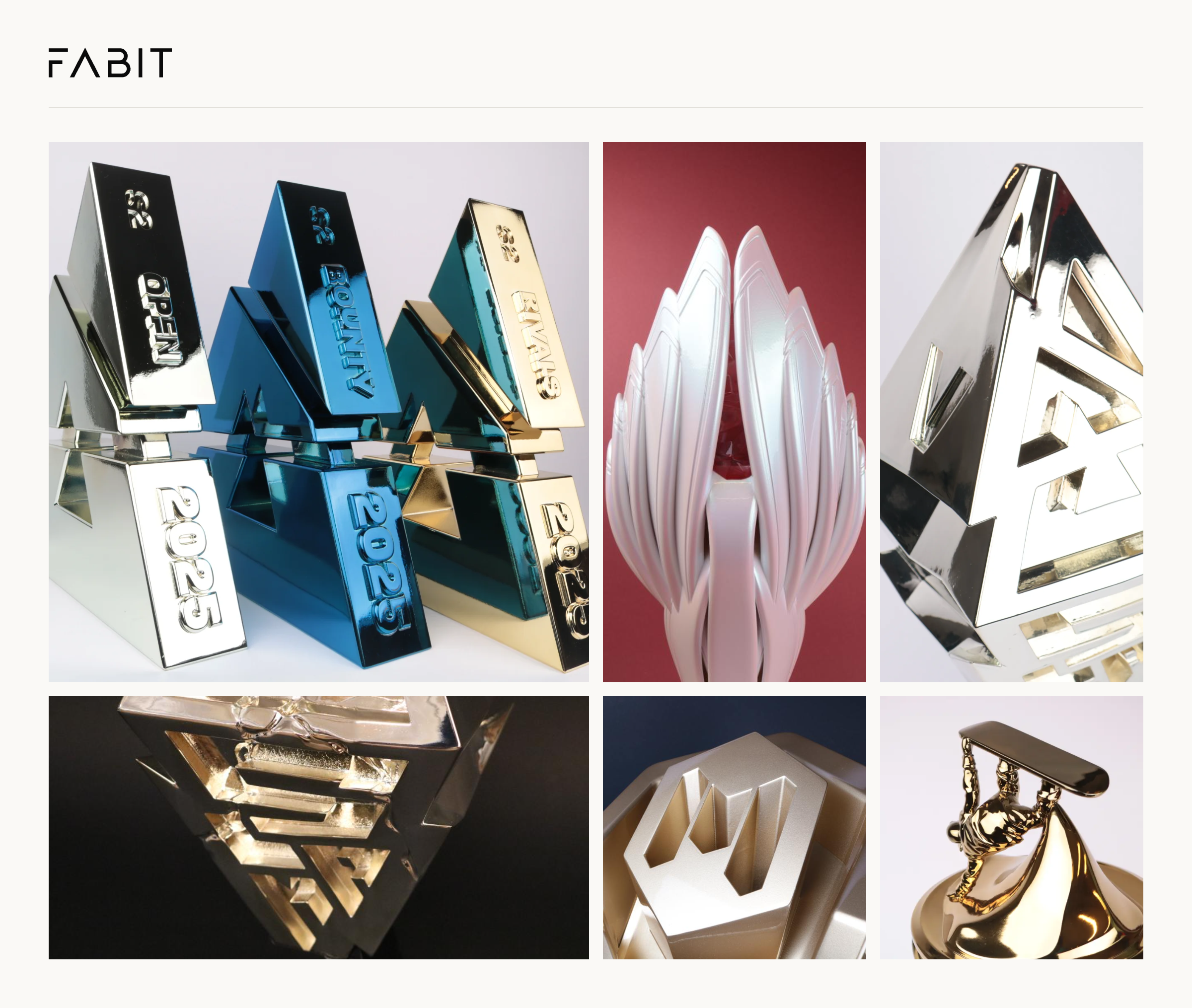
Many programmes involve a set of awards at different tiers or sizes. Maintaining consistent proportion across the family is what makes them read as a coherent collection rather than a random assortment. A gold, silver, and bronze tier should share proportional DNA even as their details differ. We design families as systems, so proportion ties them together.
Proportion and material
Material influences proportion because different substrates carry weight and light differently. A dense metal form can be slimmer and still feel substantial, while a lighter material may need more generous proportions to feel grounded. Our materials overview helps align proportional choices with the physical reality of each substrate.
Häufig gestellte Fragen
Why does proportion matter more than detail?
The eye reads overall relationships before individual details. Poor proportion undermines even the finest detailing, while good proportion elevates everything.
Can you fix a trophy that looks off?
Often the issue is proportion, and we can rebalance base, form, and text relationships to resolve it during design.
How do you keep a set of awards consistent?
We design award families as systems that share proportional relationships, so they read as one collection.
How do we start?
Share your brief and our Antwerp studio responds within 24 hours to develop proportionally resolved concepts.
Related terms